Hello Pretty is Winding Down

After more than ten fulfilling, magical years beginning in the good old days of 2012, Hello Pretty is retiring and heading off to the beach with a drink with a tiny umbrella.

Read our goodbye letter

Hello Pretty

New things from Kallie! Get your Africa on.

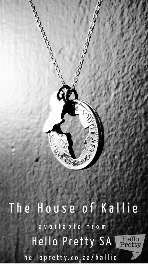
I just saw on Kallie's facebook page that they've got their Double Africa necklaces up on their Hello Pretty store. They're in either silver or gold. My sentimental patriotic heart does a little skip for these beauties. My favourite is the silver :)

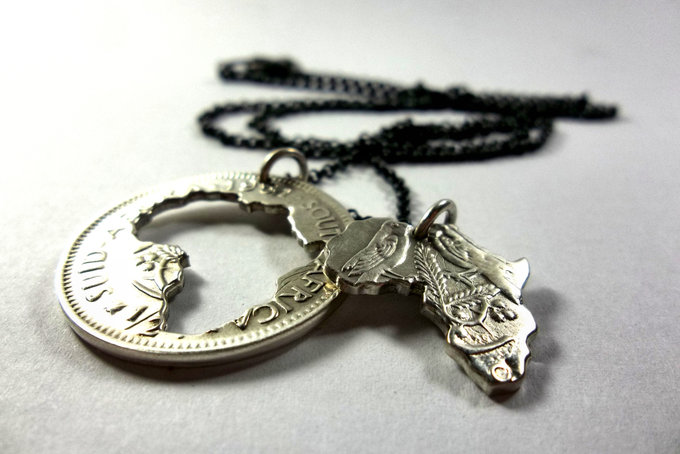
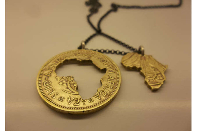
You can get the silver ones over here: https://hellopretty.co.za/kallie/coin-series-sterling-silver-double-africa and the brass ones over here: https://hellopretty.co.za/kallie/coin-series-pendant-old-brass-12-centdouble-africa-cut-away

If you're one of the ladies who ordered one of these necklaces pretty please send us a selfie - we love getting action shots from our customers and sharing on our social media.

Festival fashion

Summer is a-comin' - and with it a whole host of outdoor activities, including one of SA's favourites: Music festivals and outdoor parties. These beauties are one-of-a-kind and have been customised by hand. We think they're super cute and festival-ready - throw on some shades and you're good to go! You can get them from Chook Clothing here.

We featured this item in our newsletter this week, along with a curated collection of our favourite items to get you looking festival fabulous. There's a new theme every week, so if you'd like to be kept in the loop, sign up below!

Kirstenbosch Treetop Canopy Walk

Feeling sunshine on my bare shoulders has become a bit of a drug (wearing sunscreen, obvs. I don't go full addict), so in pursuit of my next after-winter hit of spring, I headed out to the much talked about treetop canopy walk at the Kirstenbosch gardens.

Cape Town played along, gifting me with the sunshiney-est day ever. It was the most beautiful weather (spaghetti strap shirts ENGAGE).

So FYI, it sways. A lot. Rumour has it it's supposed to, but just be warned. Once I'd gotten my sea legs I felt so privileged to be surrounded by so much beauty. We live in an incredible country you guys. We don't lack for amazing and varied scenery.

My only complaint is that the walkway itself is a bit short. Luckily we were spoilt for choice in the gardens, lazing around and dodging canoodling couples. It was a pretty fantastic way to celebrate the end of winter.

Ugh. Disgusting. You shouldn't go.

Hello Pretty x Nespresso: Interview with Jean de Wet

Here at HPHQ, we've never met a cup of coffee we didn't like. So you can imagine our delight when Nespresso invited us to check out their beautiful new space in Canal Walk. They'd decided to do something special with this new store; and when we got given a sleeve with three boxes of their famous pods to take home, it took a while for our delicious coffee haze to let us register the design on the sleeves.

On closer inspection, the front and back are two panels of an illustration by the extremely talented Jean de Wet, done exclusively for Nespresso. I promptly made myself a cup of one of my favourites (the Rosabaya), and sat down to examine it. It's quite different from his usual style, and is made up of bright, colourful illustrations of iconic buildings around Cape Town.

I had so many questions to ask - Nespresso put us in touch and a couple of emails later he very graciously answered them!

  1. What made you decide to choose architecture as a means of characterising the city?
    Besides being a fan of architecture, I wanted to make the Cape Town recognisable without using any specific natural landmarks, i.e. Table Mountain. So I ended up drawing the view from Table Mountain instead of Table Mountain itself. Each region of the city also has its own recognisable architectural character, which made it a really fun and logical to represent the city in this way.
     
  2. Do you have any favourite buildings in Cape Town, and where are they on the sleeve?
    I have way too many favourites! In fact, all the buildings represented in the illustration are ones I could remember off the top of my head, or ones I searched my memory for. I wanted to show the city based on my own personal knowledge, in order to instill a spirit of spontaneity. I decided to restrict my research no further than what the facades of actual buildings look like. So, in some way, they all have a personal connection to me. But if I had to choose one in the illustration, I’d say the "Block House" on Devil's Peak, because I hardly know anything about it - which makes it kind of creepy and mysterious. I also refuse to Google it, or participate in any discussion pertaining to its origins!
     
  3. The sleeve is a bit of a departure from your usual style of illustration - what made you decide to go that route?
    It was important for me to be able to identify the buildings easily - and a large part of the identification process has to do with colour. The Bo-Kaap area for example is famous for its colourful exteriors, and I really wanted to be able to show that in this illustration. So in a way, my need for "character in colour" allowed me to bend my own rules a bit, and so the rest of it fell into place after some initial test drawings. Since there were so many buildings I had to include, I tried to stick with stylised facades that made it easier for me to place and assemble them. Other than that, I still used my usual process for creating an illustration.
     
  4. How long did the design process take you, and what medium did you do it in?
    From start to finish, it took me just a little over a week. I started with schematic drawings of the city and where each region should be as best as best I could remember. Then made new sketches of the buildings in those regions, figuring out which ones to include. Then a final large pencil sketch (but still slightly rough) of the defined buildings in their places. After scanning that drawing, I started working over it by hand with my Wacom tablet, drawing each building on a different layer in photoshop. Although there are many different colours in this illustration, I tried to re-use as many of the existing colours as possible, going for a large, but unified palette.
     

For those of you not familiar with Jean's work, you can see more of his phenomenal illustration here and here, and stay in touch on Twitter. In the meantime, enjoy the full illustration in all its glory.

Scatter joy with Hello Pretty!

Scatter joy with Hello Pretty!

Err'body needs a colour thesaurus

I felt like I needed my Monday to start with a burst of colour. I mean, there are worse ways to start the week right?

So writer Ingrid Sundberg took it upon herself to help out anyone that was feeling a bit overwhelmed by all the fawns, oysters, cantaloupes and periwinkles of the colour world, by putting together a fun infographic showing them all off.

I’ve learned that we all have different associations with color words,” Sundberg told Bored Panda. “For example the color sapphire is a light blue to me (since that’s the color of the sapphire on my engagement ring), but a sapphire can also be a very dark blue. I doubt there can be an ‘official color guide,’ as color is so subjective.

Writer Ingrid Sundberg creates colour thesaurus on hellopretty.co.za

There was no official color guide. This was something I made for myself based on color words I liked and the colors the words evoked for me.

Fun right? Now you go off and have a bright and colourful day.

Hello Man Staff Picks: Scott

Hello Man Staff Picks: Scott

It's our final staff picks day! And to round it all off, our dev genius Scott is at the wheel with all of his favourite things:

"I don't usually shop. But when I do, I do it online. While Hello Pretty primarily has a strong female focus, there's more than enough for selection for any guy with a bit of style (and in my case, without style as well!). My list covers everything that would add a bit of class to my day to day life. For the flat, an amazing bookcase is a must and Hello Pretty / Hello Man is actually full of them, but my personal favourite (love their simple design) are the illusion bookshelves from simpli decor. I'd round that off with a nice wall clock from Louw Roets, a side table, and a lamp.

A bench for the patio to chill on coffee breaks, and the slippers, because the only thing better than no-pants-friday is no-pants-friday with a pair of warm slippers. especially in these wintery months.

Out and about:

Despite being a techie, I still always carry around a pen and a paper notebook, for that I prefer to use moleskins and the moleskin leather cover from Savior Brand takes those notebooks up a notch (as if they needed it). And then a nice, simple belt (probably several) is a must for any guys' wardrobe. You need to have a great selection of cufflinks for anything a bit more formal, and Hello Pretty definitely doesn't fall short on cufflinks. Though I'm not from there, I love the jozi skyline, so Duke and Dutch's cufflinks are perfect."

There you have it folks. Now you have no excuses come Christmas time!

Suikerbossie, ek wil jou hê

Heritage Day is around the corner! Our national flower is a personal favourite of mine, for its diversity and ability to grow in adverse conditions. These gorgeous magnets are hand cut and hand painted, and will give your fridge the touch of national pride it needs while it keeps the 24th's braai meat chilled. Get yours from Met Liefde here.

We featured this item in our newsletter this week, along with a curated collection of our favourite knitted, crocheted, and cross-stitched items from the site. There's a new theme every week, so if you'd like to be kept in the loop, sign up below!

Win with Hello Pretty and Glove Jewellery! - CLOSED

Folks, it finally happened. We found someone with an eyebrow game fiercer than Beyoncé's. Exhibit A:

This handsome fella is brand spanking new from the phenomenally talented Glove Jewellery. He's sterling silver, made by hand, and ridiculously good looking. And the best part? He's looking for a good home. Could it be with you?

Here's what you need to do if you'd like to win him:​

Entries close at midday on Friday 19th September. Hello Pretty's standard competition Ts and Cs apply. Note that only one extra entry per channel will be counted.


Hello Pretty Staff Picks: Ads

Hello Pretty Staff Picks: Ads

Staff picks time! Today we have the lovely and talented Ads, and what she would like you all to gift her with this Christmas:

"Having to choose these was simultaneously ridiculously easy and incredibly hard. I've got a list as long as my arm of things I want from Hello Pretty, so finding items was a piece of cake - narrowing that list down to a mere ten was torture!

 
I just moved into a new apartment that I got to decorate from scratch, and it's been really interesting seeing which recurring themes and colourways emerge. I tend to gravitate towards neutrals and then throw in a fun print, or a pop of colour or gold. These things were chosen because I already know exactly where I'll put them in my new place - and don't worry, they'll feel right at home with my already sizeable collection of other items from the site!"

Stunning! Which is your favourite?

Pages

Subscribe to RSS - Hello Pretty