

Hello Pretty x Nespresso: Interview with Jean de Wet
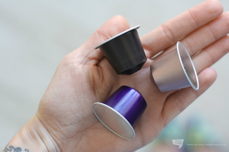
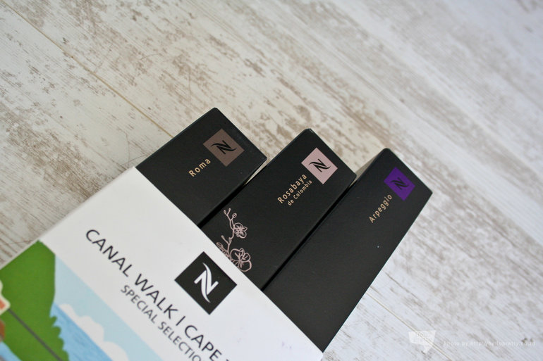
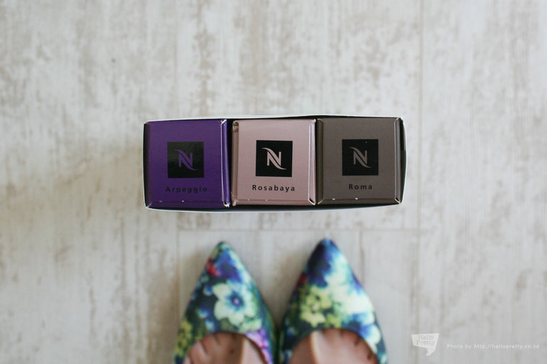
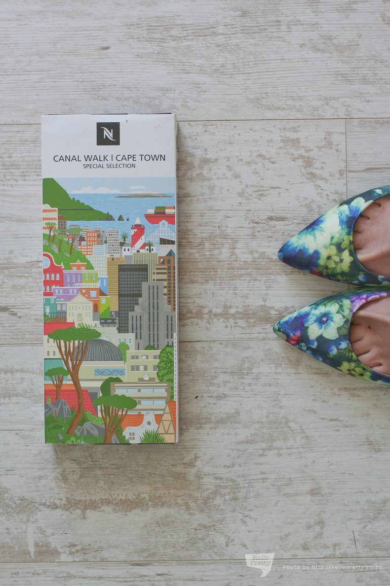
Here at HPHQ, we've never met a cup of coffee we didn't like. So you can imagine our delight when Nespresso invited us to check out their beautiful new space in Canal Walk. They'd decided to do something special with this new store; and when we got given a sleeve with three boxes of their famous pods to take home, it took a while for our delicious coffee haze to let us register the design on the sleeves.
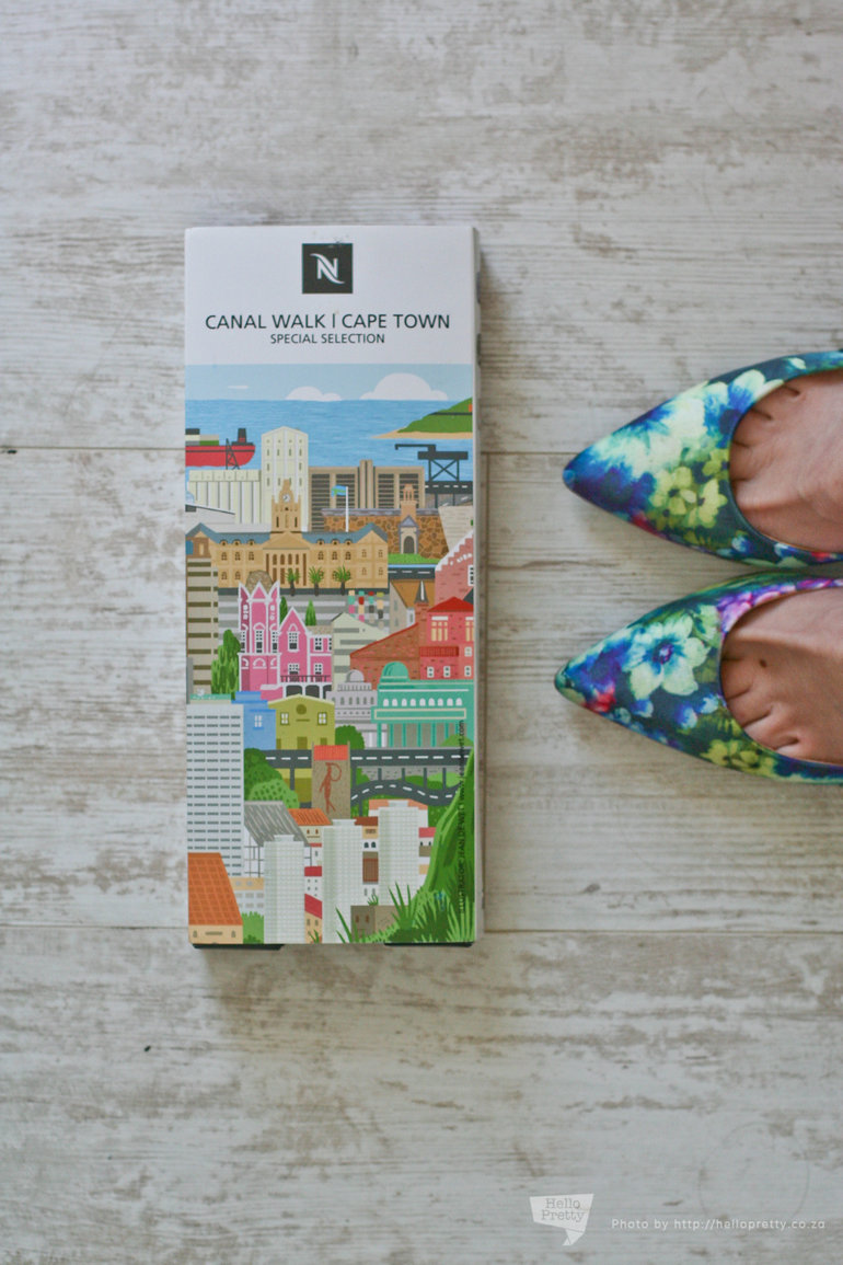
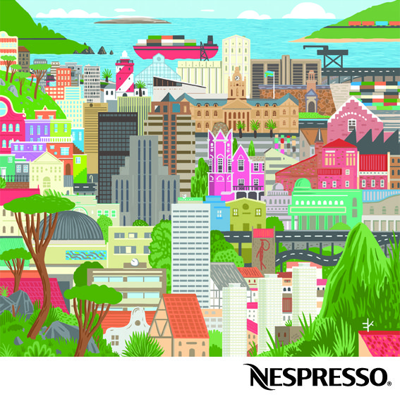
On closer inspection, the front and back are two panels of an illustration by the extremely talented Jean de Wet, done exclusively for Nespresso. I promptly made myself a cup of one of my favourites (the Rosabaya), and sat down to examine it. It's quite different from his usual style, and is made up of bright, colourful illustrations of iconic buildings around Cape Town.
I had so many questions to ask - Nespresso put us in touch and a couple of emails later he very graciously answered them!
- What made you decide to choose architecture as a means of characterising the city?
Besides being a fan of architecture, I wanted to make the Cape Town recognisable without using any specific natural landmarks, i.e. Table Mountain. So I ended up drawing the view from Table Mountain instead of Table Mountain itself. Each region of the city also has its own recognisable architectural character, which made it a really fun and logical to represent the city in this way.
- Do you have any favourite buildings in Cape Town, and where are they on the sleeve?
I have way too many favourites! In fact, all the buildings represented in the illustration are ones I could remember off the top of my head, or ones I searched my memory for. I wanted to show the city based on my own personal knowledge, in order to instill a spirit of spontaneity. I decided to restrict my research no further than what the facades of actual buildings look like. So, in some way, they all have a personal connection to me. But if I had to choose one in the illustration, I’d say the "Block House" on Devil's Peak, because I hardly know anything about it - which makes it kind of creepy and mysterious. I also refuse to Google it, or participate in any discussion pertaining to its origins!
- The sleeve is a bit of a departure from your usual style of illustration - what made you decide to go that route?
It was important for me to be able to identify the buildings easily - and a large part of the identification process has to do with colour. The Bo-Kaap area for example is famous for its colourful exteriors, and I really wanted to be able to show that in this illustration. So in a way, my need for "character in colour" allowed me to bend my own rules a bit, and so the rest of it fell into place after some initial test drawings. Since there were so many buildings I had to include, I tried to stick with stylised facades that made it easier for me to place and assemble them. Other than that, I still used my usual process for creating an illustration.
- How long did the design process take you, and what medium did you do it in?
From start to finish, it took me just a little over a week. I started with schematic drawings of the city and where each region should be as best as best I could remember. Then made new sketches of the buildings in those regions, figuring out which ones to include. Then a final large pencil sketch (but still slightly rough) of the defined buildings in their places. After scanning that drawing, I started working over it by hand with my Wacom tablet, drawing each building on a different layer in photoshop. Although there are many different colours in this illustration, I tried to re-use as many of the existing colours as possible, going for a large, but unified palette.

Posted by Adeline on 26 Sep 2014
Media old and new. Weak jokes, strong coffee, and the Oxford comma. Cheese, both literal and cultural. Cowbell. Amateur photography. Professional nitpickery.